Poverty & Education in Brooklyn, New York
Up until now, we have not worked with applied data. We have only presented theory, equations, and R commands much like a “cookbook.” This chapter presents a self-contained systematic step-by-step analysis of the influence of college education rates on poverty in order to showcase each step of the spatial analysis process. We return to our maps from the first chapter to predict the type of spatial autocorrelation we should expect; use Moran’s \(I\) and LISA methods to detect global and local spatial autocorrelation; run several different spatial models and use goodness-of-fit metrics to select the “best” approach; display the model results alongside OLS results; and include a series of additional maps that better illustrate each concept mentioned throughout this short book. By the end of this chapter, readers will be completely comfortable implementing spatial regression models, interpreting their output, visualizing their results, and undertaking a complete spatial analysis.
Exploratory Spatial Data Analysis
Recall that we are motivated by the question of whether or not a college education can lift people out of poverty. We started our analysis by mapping our variables of interest. These maps can be found below.
## Redisplaying the Maps
m1 + m2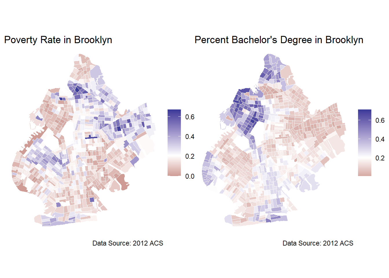
To recap what we covered in the introduction, these maps depict the distribution of poverty and college educated residents across Brooklyn. The maps provide insights into the areas of Brooklyn that are higher educated and the areas that are struggling economically. We can see that the high values of poverty rates and the high rates of bachelor degree holders are clustered in different parts of the city. The maps appear to be almost flipped images of one another with the high poverty areas being the low educational attainment areas, and vice versa. This clustering is conjectural evidence in support of positive autocorrelation. While there is certainly contextual evidence that there exists a relationship between education and poverty, as social scientists, we are interested in concrete evidence. To conduct a more rigorous analysis of the relationship between poverty and college education, we should implement some form of regression model, but first we should run tests for spatial autocorrelation.
Applied Detection of Spatial Autocorrelation
Whenever we are working with spatial data, we should run some tests for spatial autocorrelation to make sure that our errors are uncorrelated, so that we can be more confident that we are not violating the Gauss-Markov assumptions. We can implement a test for global spatial autocorrelation with Moran’s \(I\). The code is given below:
## Moran' I test
## Testing for Global Autocorrelation
brook_shape %>%
  poly2nb(c('cartodb_id')) %>% ## identifying spatial units for the weight matrix
  nb2listw(zero.policy = TRUE) %>% ## allowing distant weights to be zero
  moran.test(brook_shape$poverty_rate, ., zero.policy = TRUE) ## running moran test
    Moran I test under randomisation

data:  brook_shape$poverty_rate
weights: .

Moran I statistic standard deviate = 24.778, p-value < 2.2e-16
alternative hypothesis: greater
sample estimates:
Moran I statistic       Expectation          Variance
     0.5254679040     -0.0013368984      0.0004520155
The result is a large positive \(I\) and an extremely small \(p\)-value, leading us to reject the null hypothesis that there is no spatial autocorrelation in poverty rates. The large and positive value of \(I\) indicates positive autocorrelation. We can conduct the same test for our main independent variable: percent with bachelor’s degree.
## Moran' I test
## Testing for Global Autocorrelation
brook_shape %>%
  poly2nb(c('cartodb_id')) %>%
  nb2listw(zero.policy = TRUE) %>%
  moran.test(brook_shape$bach_rate, ., zero.policy = TRUE)
    Moran I test under randomisation

data:  brook_shape$bach_rate
weights: .

Moran I statistic standard deviate = 35.912, p-value < 2.2e-16
alternative hypothesis: greater
sample estimates:
Moran I statistic       Expectation          Variance
     0.7617824779     -0.0013368984      0.0004515575
Moran’s \(I\) is even larger and more positive for the percent bachelor’s degree variable and the \(p\)-value is again extremely small, approaching 0. We can interpret this \(p\)-value as the probability that we would have gotten an estimate of spatial autocorrelation this severe if there was, in fact, no spatial autocorrelation.
Both visually from a close examination of the maps of poverty and college educated residents and formally from a statistical test for spatial autocorrelation, we can see evidence that our variables of interest exhibit spatial autocorrelation.
Another tool that we can use to illustrate spatial autocorrelation is the following scatterplot:
## Scatterplot for Spatial Autocorrelation
brook_shape %>%
  poly2nb(c('cartodb_id')) %>%
  nb2listw(zero.policy = TRUE) %>%
  moran.plot(brook_shape$poverty_rate, ., zero.policy = TRUE, ## plot command
                  xlab = "Poverty Rate",
                  ylab = "Lagged Neighbors' Poverty Rate")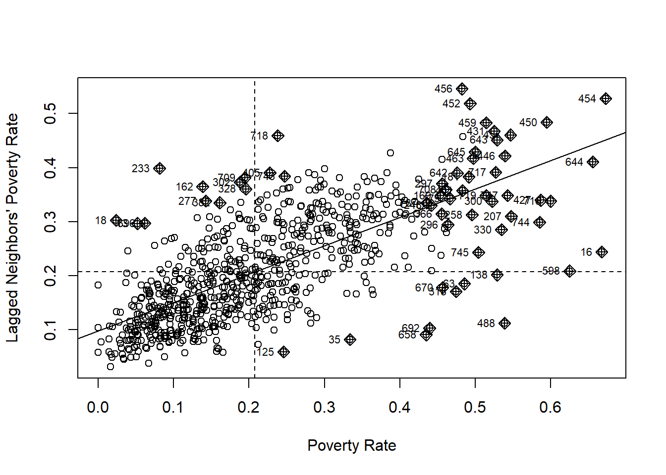
The scatterplot above uses unit, \(i\)’s poverty rate to predict \(i\)’s neighbor’s poverty rate. If the poverty rate of \(i\) is a statistically significant predictor of the poverty rate of \(i\)’s neighbors, then we have evidence of spatial autocorrelation. We can see a strong positive relationship in the scatterplot above which is consistent with the results of the global Moran’s \(I\) test above.
Now that we have evidence for global autocorrelation, we should also test for local autocorrelation. Our first piece of evidence that our data may exhibit local autocorrelation is the number of observations in the scatterplot above that are clustered. The top-right quadrant indicates a High-High spatial autocorrelation relationship, meaning census tracts with high levels of poverty are clustered nearby with other census tracts with high levels of poverty. We can see that there are other clusters, though smaller in number, present in the other quadrants as well. This indicates some degree of heterogeneity in our spatial autocorrelation.
To test for LISA more formally and rigorously, we use localmoran(). First, we calculate the weights for each census tract with the code below. We will also use this code to calculate the weights needed for the spatial regression models. This code contains the same commands we used above for pre-processing our data for global Moran’s \(I\) testing.
## Creating Weights for Spatial Autocorrelation
brook_nb <- brook_shape %>%
  poly2nb(c('cartodb_id')) %>%
  nb2listw(zero.policy = TRUE)
With the weights calculated, we can estimate local Moran’s \(I\) for each census tract in our data with spdep::localmoran(). We also allow weights of neighbors to be 0 by setting zero.policy=TRUE and omit NAs.
## Local Moran's I
lisa <- spdep::localmoran(brook_shape$poverty_rate, brook_nb,
                          zero.policy = TRUE, na.action = na.omit)
When we run localmoran(), R returns a new dataframe with the same number of rows as the input dataframe, but with five new variables that can be used to detect and characterize the local spatial autocorrelation in our data. The variables and their definitions are explained in the table below that we adapted from this guide.
| Variable | Definition |
|---|---|
| Ii | Local Moran \(I\) statistic |
| E.Ii | Expected Value of Local Moran \(I\) statistic |
| Var.Ii | Variance of Local Moran \(I\) statistic |
| Z.Ii | Standard deviation of local Moran \(I\) statistic |
| Pr(z > 0) | \(p\)-value of local Moran statistic |
The goal when analyzing local Moran’s \(I\) values is to catalog census tracts depending on if they are a part of a cluster or if they do not have significant local autocorrelation. When \(I_i\), which is Moran’s \(I\) for census tract \(i\), is high, it means that there is a cluster around \(i\) that has similar values either low or high. A low \(I_i\) means that there is no cluster and a unit is surrounded by values that are not similar. In other words, we can classify each unit as either being a part of a cluster or an outlier depending on the value of \(I_i\). We can further classify each census tract into High-High, High-Low, Low-Low, and Low-High as mentioned previously.
Before we can run a formal statistical test for local autocorrelation, we first have to choose a confidence level. While we select the \(.05\) level because it is customary, this choice is obviously subjective. The following code defines a confidence level and then takes the mean of the poverty rate.
## Selecting the confidence level
confidence_level <- 0.05
## Mean of poverty
mean_pov <- mean(brook_shape$poverty_rate)
With the confidence level chosen and the mean of our dependent variable calculated, we can find each census tract that has statistically significant local spatial autocorrelation. We calculate the classification of local spatial autocorrelation based on three criteria: the statistical significance as determined by the \(p\)-value of the local Moran’s \(I\) test; the estimated value of the local \(I\); and whether or not the census tract’s poverty rate is above, below, or equal to the mean poverty rate. We also assign the character value “Not Significant” to the NAs.
## Calculating LISA based on code from DGES (2022)
lisa <- lisa %>%
  as_tibble() %>%
  set_colnames(c("Ii","E(Ii)","Var(Ii)","Z_Ii","Pr(z > 0)")) %>%
  mutate(lisa_pov = case_when(
  `Pr(z > 0)` > 0.05 ~ "Not significant",
  `Pr(z > 0)` <= 0.05 & Ii >= 0 & brook_shape$poverty_rate >= mean_pov ~ "HH",
  `Pr(z > 0)` <= 0.05 & Ii < 0 & brook_shape$poverty_rate >= mean_pov ~ "HL",
  `Pr(z > 0)` <= 0.05 & Ii >= 0 & brook_shape$poverty_rate < mean_pov ~ "LL",
  `Pr(z > 0)` <= 0.05 & Ii < 0 & brook_shape$poverty_rate < mean_pov ~ "LH",
))

# Joining Type to Spatial Data
brook_shape$lisa_pov <- lisa$lisa_pov %>%
  replace_na("Not significant")
Now, we can plot the classification for each census tract with library(ggplot2).
## Poverty Rate LISA Plot
lisa.1 <- ggplot(brook_shape) +
  geom_sf(aes(fill=lisa_pov)) +
  scale_fill_manual(values = c("red","pink","lightblue", "blue","NA"), name="Clusters or \nOutliers") +
  labs(title = "Local Spatial Autocorrelation in Brooklyn's Poverty Rate") +
  theme_void()
lisa.1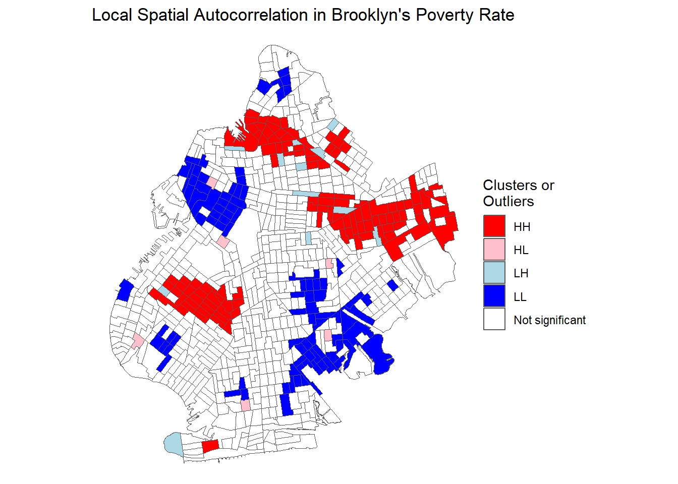
Each classification is visually represented in the plot above. White census tracts have no significant spatial autocorrelation, light blue tracts are Low-High, blue tracts are Low-Low, pink tracts are High-Low, and red tracts are High-High. Many of the clusters of high poverty census tracts are the same tracts that we pointed out when looking at our basic maps, but we now have a more rigorous way to detect and visualize clustering and we know the exact type of clustering.
So far, we have shown several different methods to detect spatial autocorrelation: visually by simply looking at a map of a variable, with global Moran’s \(I\), and with local Moran \(I\)’s when we suspect there may be heterogeneity in spatial autocorrelation. Now that we know our data exhibits spatial autocorrelation, we turn to methods to model spatial relationships and purge the autocorrelation from the error term of our models.
OLS Results
We can think of a basic OLS model such as is presented below to start.
\[poverty_{i}=\alpha + \beta\ bachelor_{i} + \delta X' + \nu_{i}\]
Where:
- \(poverty_i\) is the poverty rate of census tract \(i\) in Brooklyn, New York.
- \(\alpha\) is the intercept
- \(\beta\) is our main coefficient of interest
- \(bachelor_i\) is the percent of census tract \(i\)’s population with a bachelor’s degree
- \(\delta \Lambda'\) is a matrix of covariates and a vector of their coefficients
- \(\nu_i\) is the error term which we can test for spatial autocorrelation
Knowing that our data is spatially autocorrelated, we want to use the techniques discussed in previous chapters to purge our error term of spatial autocorrelation. For illustrative purposes, however, we will first estimate the above OLS model. We include covariates for the proportion of a census tract’s population that is part of a minority identity group such as African-American, Asian, and Hispanic and a variable that indicates the tract’s labor force participation rate. Our analysis here is quite basic and only intended for illustrative purposes. The code below runs two models with lm() and saves the results as ols. and ols.2. We further use the AIC() command to calculate AIC values which will be used for model selection criteria.
## OLS Models
ols.1 <-lm(poverty_rate~bach_rate, data=brook_shape)
ols.2 <-lm(poverty_rate~bach_rate + lab_force_rate +  per_aa +
             per_asian + per_his, data=brook_shape)

## Calculating AIC
ols.1$AIC <- AIC(ols.1)
ols.2$AIC <- AIC(ols.2)
We can then visualize the results with library(stargazer).
| Dependent variable: | ||
| Poverty Rate | ||
| (1) | (2) | |
| Bachelor’s Degree | -0.503*** | -0.317*** |
| (0.027) | (0.039) | |
| Labor Force | -0.335*** | |
| (0.045) | ||
| African-American Pop | 0.006 | |
| (0.015) | ||
| Asian Pop | -0.044 | |
| (0.031) | ||
| Hispanic Pop | 0.188*** | |
| (0.023) | ||
| Constant | 0.311*** | 0.455*** |
| (0.007) | (0.024) | |
| Observations | 749 | 749 |
| R2 | 0.312 | 0.413 |
| Akaike Inf. Crit. | -1,223.201 | -1,334.482 |
| Note: | p<0.1; p<0.05; p<0.01 | |
Let’s examine the results. Our null hypothesis is that higher rates of residents with bachelor degrees in a census tract will have no effect on a census tract’s poverty rate. In both the simple regression model and the multiple regression model, the bachelor’s degree variable is statistically significant. Our \(p\)-value is extremely close to zero and the 95% confidence interval does not cross zero, providing evidence to reject the null hypothesis that there is no relationship between rates of college education and rates of poverty for census tracts in Brooklyn.
These results indicate that the census tracts that have a high level of bachelor’s degree attainment have lower levels of poverty, as evidenced by the negative coefficient on the bachelor’s degree variable. We are modeling an inherently spatial relationship, however, so we should be concerned that spatial autocorrelation is causing our standard errors to be incorrect. Incorrect standard errors could lead us to commit a Type I error, or rejecting the null hypothesis when we should not. We also ran Moran’s \(I\) test and found evidence of statistically significant univariate spatial autocorrelation, so we should be concerned about violating the assumptions of OLS. To account for spatial autocorrelation, we can run a spatial error or a spatial lag model. We estimate both and report the results below.
Spatial Error Results
Before we can estimate a spatial error or any spatial regression model, we must calculate weights based on the degree of spatial autocorrelation our variables exhibit. The following code detects spatial autocorrelation and creates weights to be used in the spatial error and spatial lag models. We have used this same code just above and we can no re-use it for estimating our models.
## Creating Weights for Spatial Autocorrelation
brook_nb <- brook_shape %>%
  poly2nb(c('cartodb_id')) %>%
  nb2listw(zero.policy = TRUE)
Now with the weights created, we can estimate a spatial error model with errorsarlm(). We estimate both a simple and multiple regression model with the same control variables that are included above in the OLS model. There are some additional arguments beyond what is required for an OLS models to properly use errorsarlm(). The weights must be included, which we named brook_nb, we need to specify zero.policy=TRUE which allows weights to equal zero, and omit NAs. The spatial error model is:
\[poverty_{i}=\alpha + \beta\ bachelor_{i} + \delta X' + \nu_{i}\] \[\nu_i=\lambda_{Err}\ W_i\nu_i + \epsilon_i\] The following code estimates the model:
## Spatial Regression Models
spat_err.1 <- errorsarlm(poverty_rate~bach_rate, data=brook_shape,
                         listw = brook_nb, zero.policy = TRUE, na.action = na.omit)

spat_err.2 <- errorsarlm(poverty_rate~bach_rate + lab_force_rate +  per_aa +
                           per_asian + per_his, data=brook_shape,
listw = brook_nb, zero.policy = TRUE, na.action = na.omit)| Dependent variable: | ||
| Poverty Rate | ||
| (1) | (2) | |
| Bachelor’s Degree | -0.558*** | -0.382*** |
| (0.039) | (0.048) | |
| Labor Force | -0.309*** | |
| (0.038) | ||
| African-American Pop | -0.013 | |
| (0.022) | ||
| Asian Pop | 0.003 | |
| (0.037) | ||
| Hispanic Pop | 0.113*** | |
| (0.031) | ||
| Constant | 0.325*** | 0.470*** |
| (0.012) | (0.027) | |
| Observations | 749 | 749 |
| Log Likelihood | 757.835 | 795.116 |
| sigma2 | 0.007 | 0.006 |
| Akaike Inf. Crit. | -1,507.669 | -1,574.233 |
| Wald Test (df = 1) | 361.098*** | 315.985*** |
| LR Test (df = 1) | 286.468*** | 241.751*** |
| Note: | p<0.1; p<0.05; p<0.01 | |
The statistically significant, \(p <.01\), estimate of \(\lambda\) shown when we run summary() indicates the error term was spatially autoregressive.
## Summary Table 2
summary(spat_err.2)
Call:errorsarlm(formula = poverty_rate ~ bach_rate + lab_force_rate +
    per_aa + per_asian + per_his, data = brook_shape, listw = brook_nb,
    na.action = na.omit, zero.policy = TRUE)

Residuals:
       Min         1Q     Median         3Q        Max
-0.4760406 -0.0554215 -0.0031557  0.0467179  0.3180549

Type: error
Coefficients: (asymptotic standard errors)
                 Estimate Std. Error z value  Pr(>|z|)
(Intercept)     0.4703096  0.0266867 17.6234 < 2.2e-16
bach_rate      -0.3823724  0.0481311 -7.9444 1.998e-15
lab_force_rate -0.3094660  0.0383967 -8.0597 6.661e-16
per_aa         -0.0128207  0.0222885 -0.5752 0.5651472
per_asian       0.0034432  0.0369514  0.0932 0.9257592
per_his         0.1131288  0.0311996  3.6260 0.0002879

Lambda: 0.65103, LR test value: 241.75, p-value: < 2.22e-16
Asymptotic standard error: 0.036624
    z-value: 17.776, p-value: < 2.22e-16
Wald statistic: 315.98, p-value: < 2.22e-16

Log likelihood: 795.1164 for error model
ML residual variance (sigma squared): 0.0063921, (sigma: 0.07995)
Number of observations: 749
Number of parameters estimated: 8
AIC: -1574.2, (AIC for lm: -1334.5)
Regardless of any other metric we can use to evaluate the efficacy of this spatial error model in terms of other model specifications, the fact that we have statistically significant evidence of spatial autocorrelation means that this model is preferable to OLS. To further confirm this, we can compare the models in terms of the Akiake Information Criterion (AIC). AIC is a goodness-of-fit measure that shows how well the model fits the data, and we can use it to select the highest performing model. Lower AIC values are associated with better performing models. The output of errorsarlm() using the summary() function in base R provides information about how well the spatial error model and the OLS mdoel performed. The AIC for the spatial error model is \(\approx\) -1574 and the AIC for the OLS model is \(\approx\) -1334, indicating that the spatial error model performed better than OLS.
In terms of substantive changes, there are few. We see no significant changes in the statistical significance of the variables in the model. Overall the substantive conclusions from the OLS model are very much the same as the spatial error model. Our main variable of interest, the proportion of residents with a bachelor’s degree, remains statistically significant at the \(p<.01\) level and has a similar, yet not exactly the same, coefficient. Importantly, the standard error is now higher, indicating that we were overestimating our certainty in the OLS model.
Spatial Lag Results
We can replicate our analysis with the spatial lag model. The spatial lag model looks like:
\[poverty_i=\rho_{lag}\ W_ipoverty_i + \beta\ bachelor_i + \delta X' + \epsilon_i\]
Recall from the previous chapter that we include a weighted lagged dependent variable as an independent variable. We can use nearly the same code as for the spatial error model, expect we substitute lagsarlm() for errorsarlm()
spat_lag.1 <- lagsarlm(poverty_rate~bach_rate, data=brook_shape,
                       listw = brook_nb, zero.policy = TRUE, na.action = na.omit)

spat_lag.2 <- lagsarlm(poverty_rate~bach_rate + lab_force_rate +  per_aa +
                         per_asian + per_his, data=brook_shape,
listw = brook_nb, zero.policy = TRUE, na.action = na.omit)| Dependent variable: | ||
| Poverty Rate | ||
| (1) | (2) | |
| Bachelor’s Degree | -0.289*** | -0.151*** |
| (0.029) | (0.036) | |
| Labor Force | -0.301*** | |
| (0.038) | ||
| African-American Pop | 0.011 | |
| (0.012) | ||
| Asian Pop | -0.012 | |
| (0.026) | ||
| Hispanic Pop | 0.115*** | |
| (0.020) | ||
| Constant | 0.145*** | 0.295*** |
| (0.013) | (0.024) | |
| Observations | 749 | 749 |
| Log Likelihood | 730.279 | 774.156 |
| sigma2 | 0.008 | 0.007 |
| Akaike Inf. Crit. | -1,452.557 | -1,532.311 |
| Wald Test (df = 1) | 262.827*** | 232.916*** |
| LR Test (df = 1) | 231.356*** | 199.830*** |
| Note: | p<0.1; p<0.05; p<0.01 | |
We can now evaluate the spatial lag model both in terms of how it performs compared to OLS and the spatial error model. The statistical significance of \(\rho\), as indicated by the extremely small \(p\)-value, is another sign that our error term in the basic OLS model was autoregressive. We need to run summary() to see this.
## Summary Table 2
summary(spat_lag.2)
Call:lagsarlm(formula = poverty_rate ~ bach_rate + lab_force_rate +
    per_aa + per_asian + per_his, data = brook_shape, listw = brook_nb,
    na.action = na.omit, zero.policy = TRUE)

Residuals:
       Min         1Q     Median         3Q        Max
-0.4385864 -0.0601209 -0.0035479  0.0491344  0.3416525

Type: lag
Coefficients: (asymptotic standard errors)
                Estimate Std. Error z value  Pr(>|z|)
(Intercept)     0.295206   0.024397 12.1003 < 2.2e-16
bach_rate      -0.151275   0.035552 -4.2551 2.090e-05
lab_force_rate -0.300922   0.038068 -7.9049 2.665e-15
per_aa          0.010590   0.012395  0.8544    0.3929
per_asian      -0.012481   0.026176 -0.4768    0.6335
per_his         0.115435   0.019991  5.7743 7.728e-09

Rho: 0.54558, LR test value: 199.83, p-value: < 2.22e-16
Asymptotic standard error: 0.035749
    z-value: 15.262, p-value: < 2.22e-16
Wald statistic: 232.92, p-value: < 2.22e-16

Log likelihood: 774.1557 for lag model
ML residual variance (sigma squared): 0.0069761, (sigma: 0.083523)
Number of observations: 749
Number of parameters estimated: 8
AIC: -1532.3, (AIC for lm: -1334.5)
LM test for residual autocorrelation
test value: 5.9247, p-value: 0.01493
This is immediate evidence that the results of this model are more accurate than OLS. We can see that the coefficient estimate on the percent bachelor’s degree variable is somewhat smaller than before. The standard errors are also different, indicating a different degree of uncertainty in our point estimate than the basic OLS or the spatial error model shows. Turning to our main model selection criteria, the AIC value is lower for the spatial lag model compared to OLS but higher than the AIC in the spatial error model. In sum, the spatial lag model performs better and is preferable to OLS, but the spatial error model is the best performing model overall. For any given research project, authors should present all three models and consider a more advanced spatial regression model to provide further robustness checks and ensure readers that results are consistent across varying model specifications.
To that end, we present all three models in the same table for ease of analysis:
| Dependent variable: | ||||||
| Poverty Rate | ||||||
| OLS | spatial | spatial | ||||
| error | autoregressive | |||||
| (1) | (2) | (3) | (4) | (5) | (6) | |
| Bachelor’s Degree | -0.503*** | -0.317*** | -0.558*** | -0.382*** | -0.289*** | -0.151*** |
| (0.027) | (0.039) | (0.039) | (0.048) | (0.029) | (0.036) | |
| Labor Force | -0.335*** | -0.309*** | -0.301*** | |||
| (0.045) | (0.038) | (0.038) | ||||
| African-American Pop | 0.006 | -0.013 | 0.011 | |||
| (0.015) | (0.022) | (0.012) | ||||
| Asian Pop | -0.044 | 0.003 | -0.012 | |||
| (0.031) | (0.037) | (0.026) | ||||
| Hispanic Pop | 0.188*** | 0.113*** | 0.115*** | |||
| (0.023) | (0.031) | (0.020) | ||||
| Constant | 0.311*** | 0.455*** | 0.325*** | 0.470*** | 0.145*** | 0.295*** |
| (0.007) | (0.024) | (0.012) | (0.027) | (0.013) | (0.024) | |
| Observations | 749 | 749 | 749 | 749 | 749 | 749 |
| R2 | 0.312 | 0.413 | ||||
| Adjusted R2 | 0.311 | 0.409 | ||||
| Log Likelihood | 757.835 | 795.116 | 730.279 | 774.156 | ||
| sigma2 | 0.007 | 0.006 | 0.008 | 0.007 | ||
| Akaike Inf. Crit. | -1,223.201 | -1,334.482 | -1,507.669 | -1,574.233 | -1,452.557 | -1,532.311 |
| Residual Std. Error | 0.107 (df = 747) | 0.099 (df = 743) | ||||
| F Statistic | 338.568*** (df = 1; 747) | 104.632*** (df = 5; 743) | ||||
| Wald Test (df = 1) | 361.098*** | 315.985*** | 262.827*** | 232.916*** | ||
| LR Test (df = 1) | 286.468*** | 241.751*** | 231.356*** | 199.830*** | ||
| Note: | p<0.1; p<0.05; p<0.01 | |||||
Geographically Weighted Regression
Following our discussion of the two main workhorse models of spatial regression, the spatial error and the spatial lag models, we talked about several more advanced techniques to estimate spatial relationships that contain a high degree of spatial autocorrelation or have heterogeneity (LISA) in their spatial autocorrelation. We now end our applied section with showing how to implement one of the most common and powerful of the more advanced models: the GWR model. We start by estimating a geographically weighted regression model, compare its performance to the above models, and visualize the results. library(GWmodel) in tandem with library(spdep) provides the tools needed to estimate a geographically weighted regression model. We first need to remove all NAs from the dataset to accurately calculate the weights.
# Remove all the NAs in the dataset
brook_shape_no_na <- brook_shape %>%
  drop_na()
Now that we have removed the NAs, we can calculate the weights for each unit. Remember: GWR models run separate regressions for each spatial unit.
# Estimate an optimal bandwidth
weights <- GWmodel::bw.gwr(poverty_rate~bach_rate + lab_force_rate +  per_aa +
                           per_asian + per_his, data = brook_shape_no_na %>%
                           sf::as_Spatial(), approach = 'AICc', kernel = 'bisquare',
                           adaptive = TRUE)
Adaptive bandwidth (number of nearest neighbours): 470 AICc value: -1597.422
Adaptive bandwidth (number of nearest neighbours): 298 AICc value: -1675.456
Adaptive bandwidth (number of nearest neighbours): 191 AICc value: -1741.217
Adaptive bandwidth (number of nearest neighbours): 125 AICc value: -1777.614
Adaptive bandwidth (number of nearest neighbours): 84 AICc value: -1784.89
Adaptive bandwidth (number of nearest neighbours): 59 AICc value: -1774.615
Adaptive bandwidth (number of nearest neighbours): 100 AICc value: -1783.689
Adaptive bandwidth (number of nearest neighbours): 74 AICc value: -1785.406
Adaptive bandwidth (number of nearest neighbours): 68 AICc value: -1782.317
Adaptive bandwidth (number of nearest neighbours): 78 AICc value: -1786.698
Adaptive bandwidth (number of nearest neighbours): 80 AICc value: -1786.662
Adaptive bandwidth (number of nearest neighbours): 76 AICc value: -1785.882
Adaptive bandwidth (number of nearest neighbours): 78 AICc value: -1786.698 Now that we have the weights calculated, we can run the main GWR model. The code to run the model and display the results is below. Unfortunately, we cannot use library(stargazer) to create a nicely formatted table for GWR models due to the nature and complexity of the output.
gwr_model <- GWmodel::gwr.basic(poverty_rate~bach_rate + lab_force_rate +  per_aa +
                                per_asian + per_his, data = brook_shape_no_na %>%
                                sf::as_Spatial(),
                                bw = weights, kernel = "bisquare", adaptive = TRUE)
print(gwr_model)
***********************************************************************
* Package GWmodel *
***********************************************************************
Program starts at: 2022-12-12 17:50:27
Call:
GWmodel::gwr.basic(formula = poverty_rate ~ bach_rate + lab_force_rate +
per_aa + per_asian + per_his, data = brook_shape_no_na %>%
sf::as_Spatial(), bw = weights, kernel = "bisquare", adaptive = TRUE)
Dependent (y) variable: poverty_rate
Independent variables: bach_rate lab_force_rate per_aa per_asian per_his
Number of data points: 749
***********************************************************************
* Results of Global Regression *
***********************************************************************
Call:
lm(formula = formula, data = data)
Residuals:
Min 1Q Median 3Q Max
-0.51295 -0.06971 -0.00265 0.05214 0.37647
Coefficients:
Estimate Std. Error t value Pr(>|t|)
(Intercept) 0.455176 0.024461 18.608 < 2e-16 ***
bach_rate -0.316727 0.038809 -8.161 1.42e-15 ***
lab_force_rate -0.335159 0.044593 -7.516 1.63e-13 ***
per_aa 0.006344 0.014649 0.433 0.665
per_asian -0.043835 0.030937 -1.417 0.157
per_his 0.188254 0.022958 8.200 1.06e-15 ***
---Significance stars
Signif. codes: 0 '***' 0.001 '**' 0.01 '*' 0.05 '.' 0.1 ' ' 1
Residual standard error: 0.09876 on 743 degrees of freedom
Multiple R-squared: 0.4132
Adjusted R-squared: 0.4092
F-statistic: 104.6 on 5 and 743 DF, p-value: < 2.2e-16
***Extra Diagnostic information
Residual sum of squares: 7.246263
Sigma(hat): 0.09849104
AIC: -1334.482
AICc: -1334.331
BIC: -2004.819
***********************************************************************
* Results of Geographically Weighted Regression *
***********************************************************************
*********************Model calibration information*********************
Kernel function: bisquare
Adaptive bandwidth: 78 (number of nearest neighbours)
Regression points: the same locations as observations are used.
Distance metric: Euclidean distance metric is used.
****************Summary of GWR coefficient estimates:******************
Min. 1st Qu. Median 3rd Qu. Max.
Intercept 0.031866 0.344127 0.466875 0.629291 1.4226
bach_rate -2.068998 -0.809901 -0.577730 -0.157502 0.4963
lab_force_rate -0.993951 -0.518528 -0.358029 -0.220822 0.3116
per_aa -0.774861 -0.131914 0.009038 0.206192 0.8688
per_asian -0.670599 -0.065272 0.073219 0.248370 1.1811
per_his -0.649584 -0.076310 0.151980 0.340791 0.7948
************************Diagnostic information*************************
Number of data points: 749
Effective number of parameters (2trace(S) - trace(S'S)): 159.9831
Effective degrees of freedom (n-2trace(S) + trace(S'S)): 589.0169
AICc (GWR book, Fotheringham, et al. 2002, p. 61, eq 2.33): -1786.698
AIC (GWR book, Fotheringham, et al. 2002,GWR p. 96, eq. 4.22): -1959.338
BIC (GWR book, Fotheringham, et al. 2002,GWR p. 61, eq. 2.34): -2023.354
Residual sum of squares: 2.724157
R-square value: 0.7793932
Adjusted R-square value: 0.7193722
***********************************************************************
Program stops at: 2022-12-12 17:50:27 The output, shown above, gives a wealth of information about regression results, goodness-of-fit metrics, and meta information about the estimation procedure. Let’s go over some of it now. We see first the results of the global regression and below, in the second section, we see the results of the GWR. Importantly, the GWR output gives us a range of coefficient estimates since we have conducted an individual regression model for each census tract. The results that we see in the second table are actually more like descriptive statistics of the distribution of estimated coefficients and other regression result metrics. We can also see the more meta information of our GWR models such as the adaptive bandwidth, the kernel function, and the distance metric. We have left all of these values default as suggested by Fotheringham et al. (2002) & Goovaerts (2008).
In terms of model selection, the GWR performs better based on AIC values than the other three models that we have estimated, with the AIC for the GWR model being the lowest of all models tested. This result indicates that the GWR models is the best performing model compared to OLS, the spatial lag, and the spatial error models. The adjusted \(R^2\) value is also higher in the GWR model as compared to OLS. We also have a higher coefficient to standard error ratio giving us a higher t-value and a more certain point estimate. While the coefficients have not changed drastically from the OLS model results, we know through the numerous techniques to detect and estimate spatial autocorrelation, that our relationship exhibited spatial autoregressive qualities and is now more accurate. We were able to increase the performance of our models, in terms of AIC, by employing GWR, showing the benefits of employing more advanced spatial modeling techniques.
Mapping Geographically Weighted Regression Results
GWR models offer a key benefit in unit level metrics that allow us to evaluate and visualize our model results on a localized level. Accordingly, an important and powerful aspect of library(GWmodel) is the ability to easily visualize results for each spatial unit. We first need to process our model results into a form that can extract coefficients, standard errors, goodness-of-fit, and other metrics from our GWR model. Specifically, spplot() cannot recognize the names of our variables resulting from the GWR model estimation (DGES 2022), so we need to change the names, which the following code does.
## Processing GWR model for visualization
gwr_proc_data <- gwr_model$SDF@data
## Changing Bachelor's Degree Variable Name
gwr_proc_data$coefbach <- gwr_proc_data$`bach_rate`
## Calculating p-values
gwr_proc_data$bachp <- 2*pt(-abs(gwr_proc_data$`bach_rate_TV`),
                            df = dim(gwr_proc_data)[1] -1)
## Creating a standard error variable
gwr_proc_data$sebach <- gwr_proc_data$`bach_rate_SE`
## Finalizing the preprocessing
processed_gwr_results <- gwr_model$SDF
processed_gwr_results@data <- gwr_proc_data
Now that we have the data processed, we end this section with the visualization of the GWR model results. Since we have estimated a series of regression models, we have resulting metrics for every single census tract. We can use this information to create maps. Perhaps one of the richest ways to visualize heterogeneity in spatial autocorrelation is with the following plots that visualize the distributions of our key model results across each census tract in Brooklyn. Visualizing the GWR model results in this fashion is an incredibly powerful technique to show how deleterious spatial autocorrelation can be and to show what localized spatial autocorrelation looks like. We start with mapping localized \(R^2\) values.
spplot(processed_gwr_results, "Local_R2", main="Local Pseudo R Squared Values")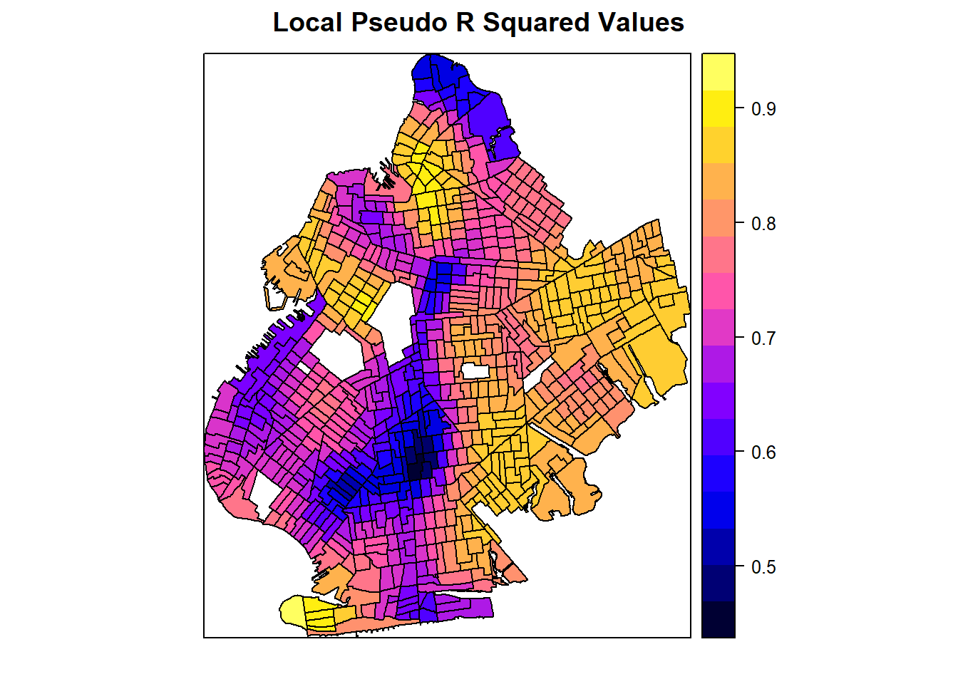
Mapping the pseudo \(R^2\) values for each census tract shows the heterogeneity in model fit depending on the tract. This adds a level of richness to our understanding of our models because we know that our model specification performs better when estimating the effect of college education rates on poverty rates in some census tracts compared to others.
spplot(processed_gwr_results, "coefbach", main="Bachelor's Degree Estimated Coefficients")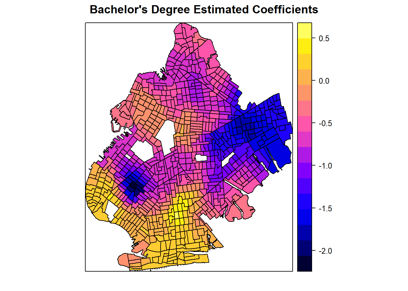
The map of estimated coefficients above shows where the effect of college education rates on poverty rates, controlling for all other factors in the model, is the highest and lowest. While our overall coefficient estimate is negative, we can see a cluster in southern Brooklyn where the estimated coefficient is positive. This tells us that bachelor’s degree attainment does not always lead to lower levels of poverty and its effect is heterogeneous across spatial units. We can also further see clustering of high and low coefficients in different locations around the borough.
spplot(processed_gwr_results, "sebach", main="Standard Error of Bachelor's Degree Coefficients")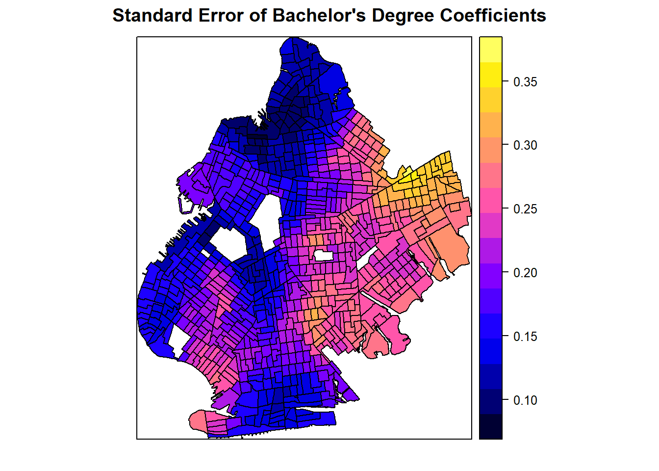
This third map shows the distribution of standard errors across census tracts. We see the lowest standard errors on the entire west side of Brooklyn with the highest standard errors in the northeastern parts of the borough. We can use this map to visualize the distribution of our uncertainty in our estimated coefficients and see where the confidence intervals will be the highest and the lowest. In other words, this is a map of our uncertainty concerning our estimated coefficients.
spplot(processed_gwr_results, "bachp", main="p-value of Bachelor's Degree Coefficients")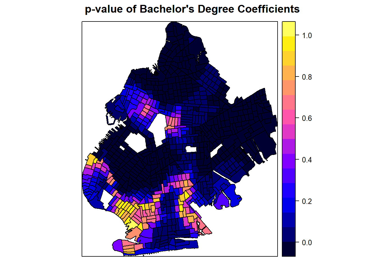
Finally, we map the distribution of \(p\)-values. We can see extremely low \(p\)-values, indicating statistical significance, across the majority of the borough with only a small cluster of census tracts where the rate of college education was not a statistically significant predictor of poverty rates. In some census tracts, the \(p\)-value is near 1!
It is an extremely good idea to create these visualizations whenever we run a GWR model so that we can better characterize the full distribution of our model results. Since GWR runs many models, only looking at averaged metrics loses the richness that makes GWR models valuable to researchers.
Concluding Remarks
We have presented an applied example that shows how to detect and manage spatial autocorrelation. The analysis presented here is not the only way that spatial data can be analyzed, and we only considered one of the more advanced spatial regression models at our disposal. It is up to researchers to make wise decisions about model specification and to be careful in how to control for differing types of spatial autocorrelation.